A couple weeks ago, I was gilding a transom on the 100 block of Fell Street. Actually, I was using the opportunity to teach Aaron how to gild on glass. He'd done a few surface gilds with us, including the huge, gruelling Stinking Rose job (hard on fingers pushing gold into the grainy stucco surface), but he'd never yet gone out with me on a window gild. I took lunch, leaving him to patch the gild, and at the same time, took the opportunity to walk around the Hayes Valley neighborhood and take pictures of some signs we'd done but never documented.

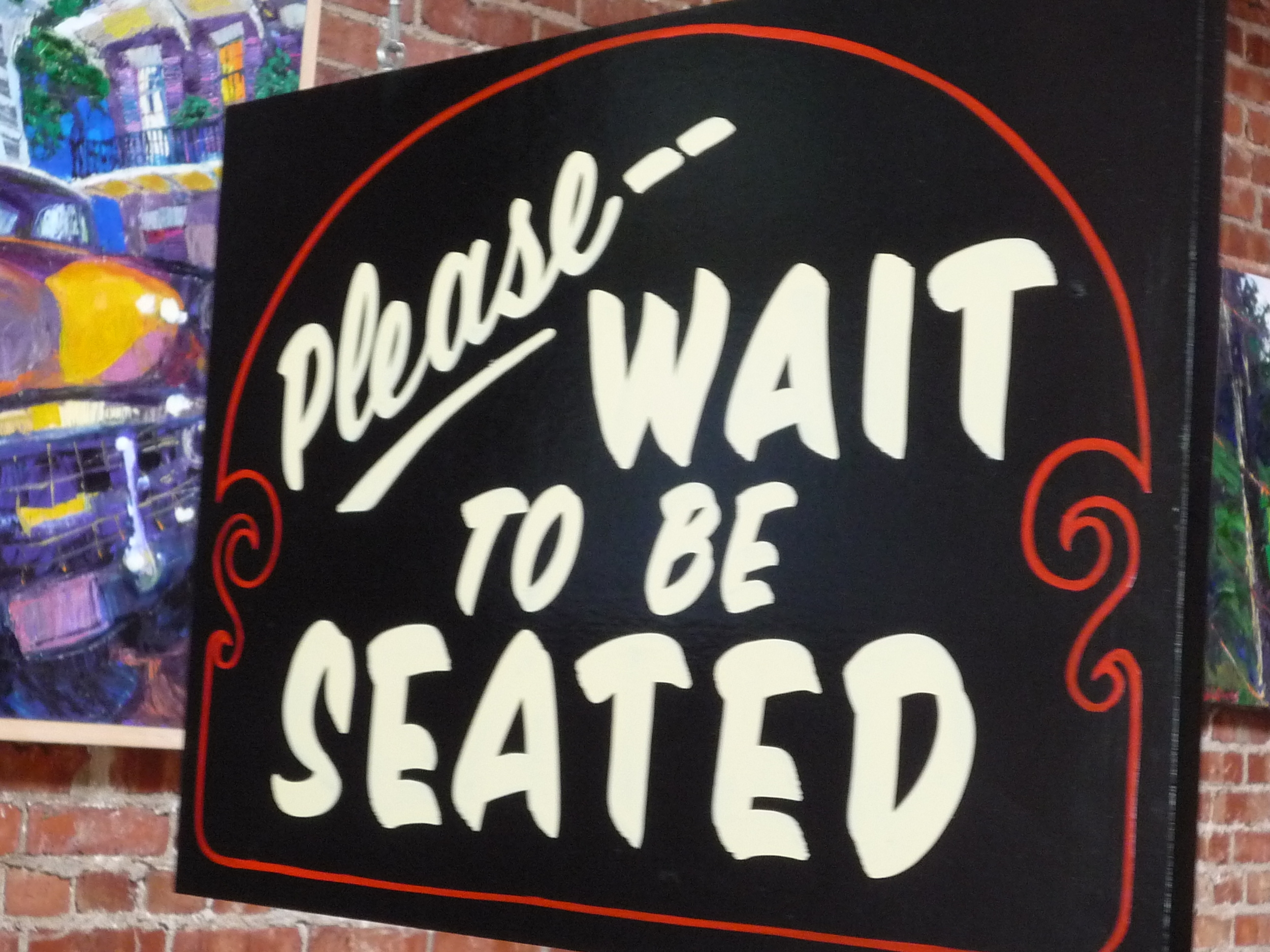
My eye is helplessly drawn to the clumsily placed diagonal "We offer --", as a clear example of an idea that works just fine as a computer sketch; but would have benefitted greatly from some attention, an eyeball, and a pencil when it came time to putting the pattern on the board. This is the slippery slope -- THE SLIPPERY SLOPE!!! -- and we are SO teetering on its crumbling edge...
to keep the loving focus and attention on beautiful use of space.

I'm very fond of collaborative efforts. I need to to suggest chalkboard sections to people more often.

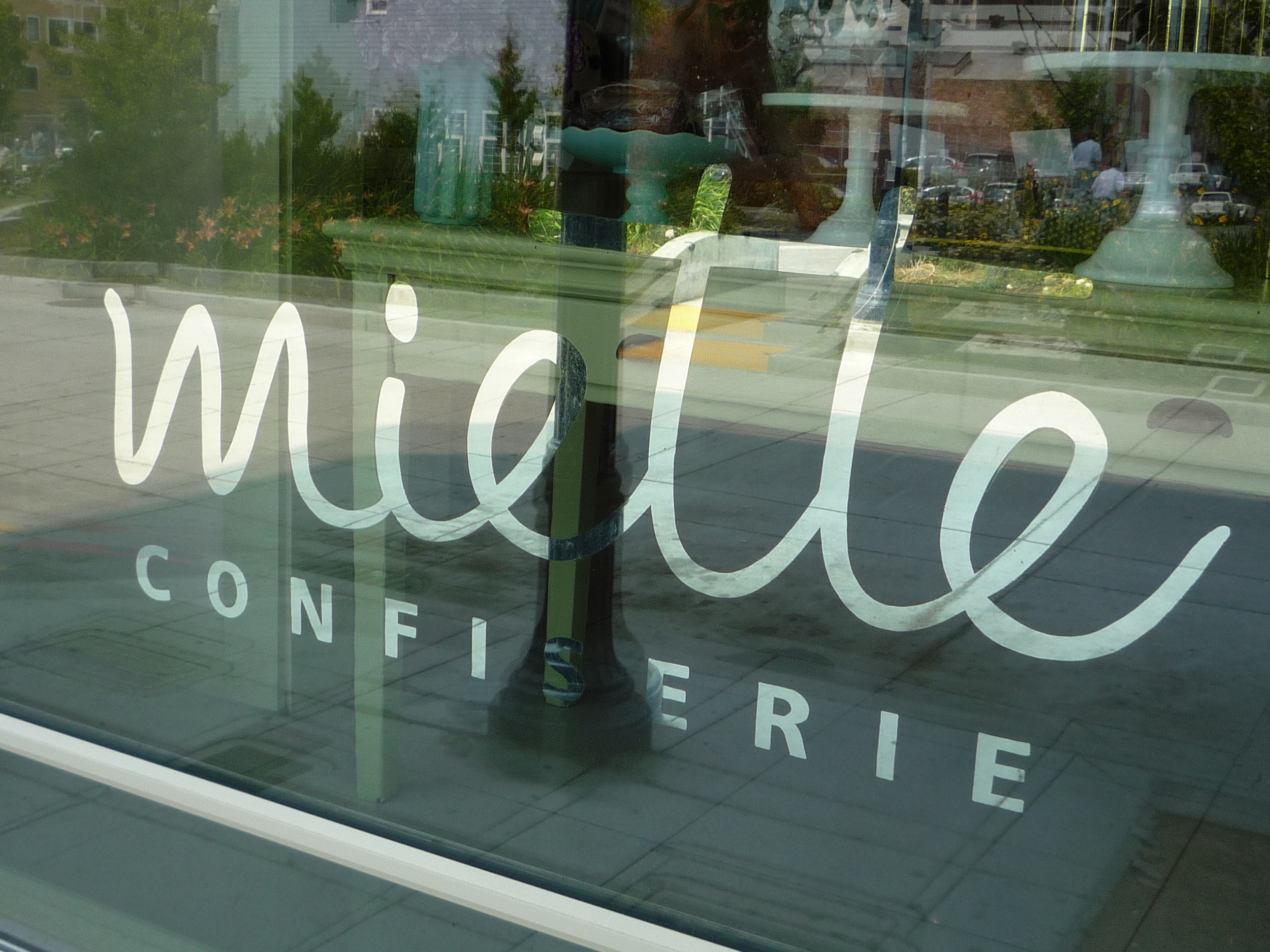
I dearly love the women at Miette Confiserie, and at their Patisserie in the Ferry Building. But they need more chalkboards in their sandwich boards.
Here's a big, wordy menu we did for Patxi's Pizza. I made use of this job to practice using Illustrator for layout. My intention was to use assorted "casual" style computer fonts to block in the text areas, and then to letter with our own individual brush lettering peculiarities. But I think the boys relied a little more on the printed fonts as guidelines than I anticipated, and I, of course, wasn't paying as much attention as I should. I guess that's the way it nearly always goes with computer aided design. My eye is helplessly drawn to the clumsily placed diagonal "We offer", on the right hand panel, as a clear example of an idea that works just fine as a computer sketch, in rough layout stage; but would have benefitted greatly from some attention, an eyeball, and a pencil when it came time to putting the pattern on the board. This is the slippery slope -- THE SLIPPERY SLOPE!!! -- and we are SO teetering on its crumbling edge...Here's a good example of what I'm talking about, although on a much smaller scale. This was laid out in pencil, and lettered in my natural hand. It's even got the same diagonal swoosh motif as the "We offer" bit on the menu; but just a little more attention results in a much more graceful use of space. I s'pose it's easier when there are only five words in the sign, but that's always the challenge: to keep a loving focus and attention on beautiful use of space.In lieu of chalkboards, I'll gladly put more white gold in their windows.
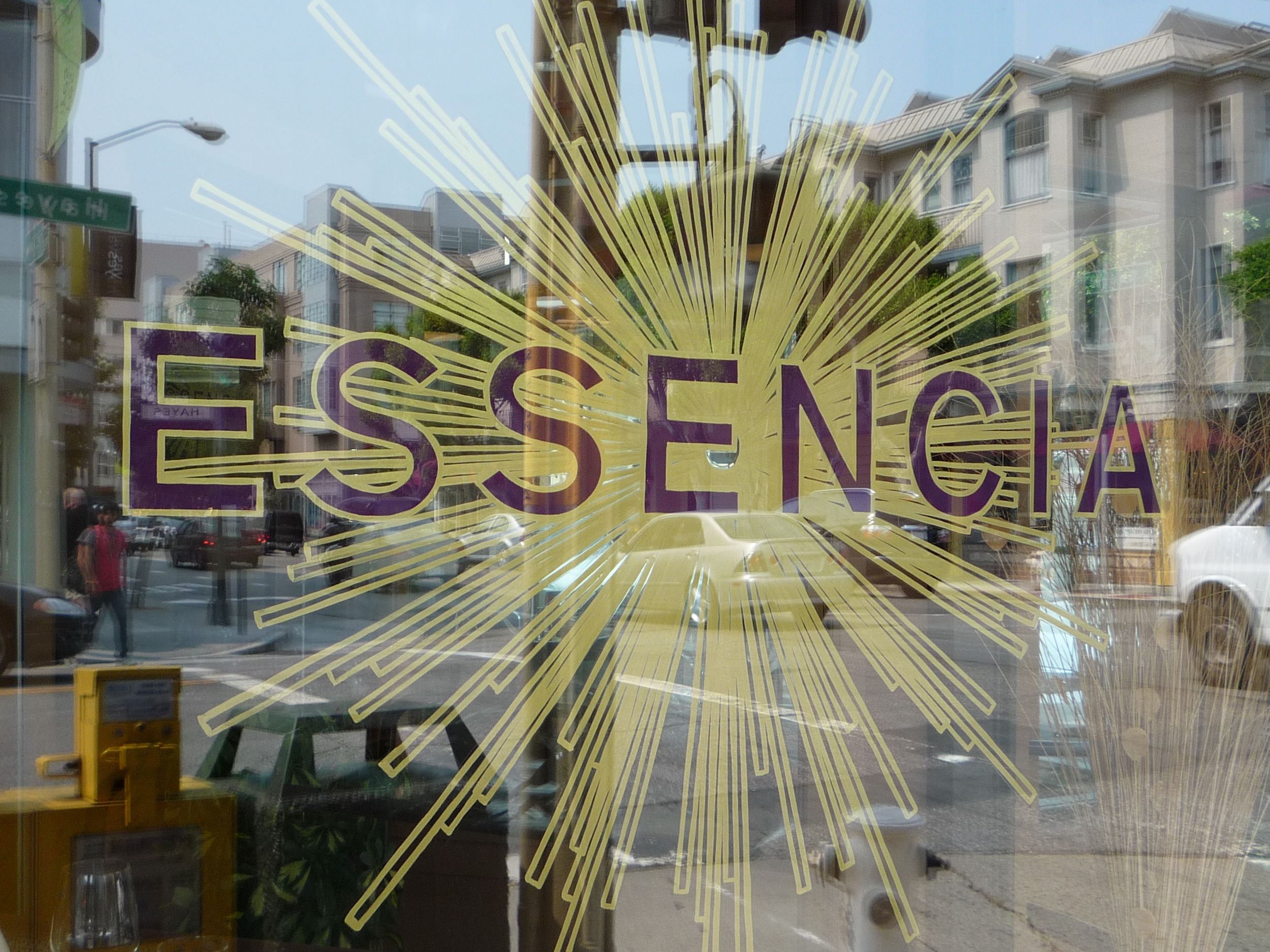
Here's a place that fed us delicious lunch while we were working on their windows. I think it was a Peruvian menu. We painted this logo on two large windows and on the front door. I remember there were something like 180 lines radiating out from that E. They, unfortunately, weren't able to invest in gold for this project, so we painted it in One Shot. We used Metallic Brass, because it shows up brighter in windows than Metallic Gold. Still frightfully dull next to actual leaf, as I think you can tell looking at the Miette window above, or the Brooklyn Circus window in the last post. However, in brightness and visibility, this is leagues above the dim transluscent decals they had in their windows before this.

Stumbling across signs you've painted, but didn't know where they ended up. Not that this is any great shakes. As I recall, Tazi was much like Essencia, in that they weren't able to invest in a more attractive, attention grabbing sign. I think originally we had a design based on a Moroccan mosaic pattern for the background (labor intensive!). Then, we retreated to a silhouette of an antique Moroccan lamp (admittedly intricate, and still a little labor intensive). And finally, they opted for... grey. I failed to suggest a chalkboard section.