Here's a shot of the finished interior signs:

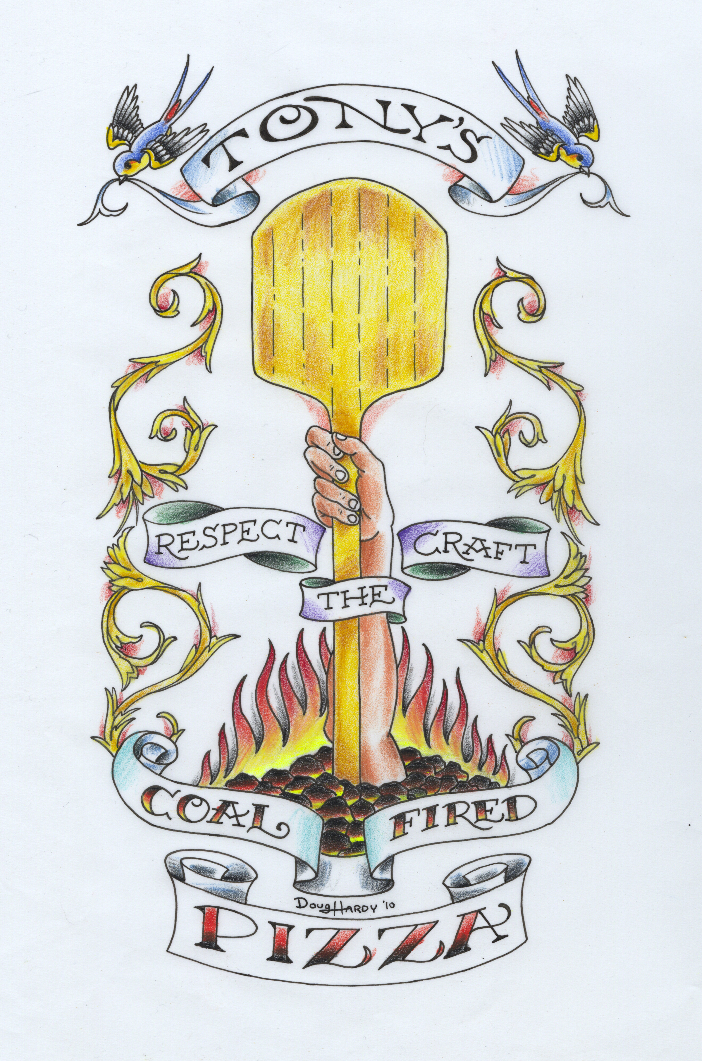
On our second day at Tony's, while Josh and Ken finished their walls, I laid down some base coats and gold leaf, for the Doug Hardy-drawn sign, in the entryway. Then, I came back and finished blending colors over all that, last Friday. Yesterday, Thursday, was the next opportunity I had to get back to the place, for the last few signs in their order, some assorted phrases in the entryway panels, intended to communicate some "NY attitude".
Here's the Doug Hardy drawing Tony gave us to paint:
 And here it is, painted and gilded, with some glass installed over it subsequently, and a couple of the other signs I painted yesterday:
Here's a detail shot of that panel:
And here are the other three panels painted in the entryway:
These last three developed similarly to how I described the interior signs in the previous post. Starting from a pencil sketch, I looked for some fonts approaching the size and shape, to build patterns from, stretching and fattening and smoothing out some curves along the way, and then just drawing in the casual script. For the "how" and the "do it", I took the chance to plug in some Roxy Black, which I learned about from this informative video:
[vimeo 10101935]
(That was fwd'd to me by Stephen Coles, shortly after he stopped by the shop to shoot Font Cast #12)
The pointing hand in the Italian ice panel is a re-sized version of a hand that we've been painting here for years, in different places, the pattern for which I finally scanned and vectorized, simultaneously sparing myself a bit of hand drawing and maybe breaking the hearts of imaginary traditionalists everywhere...
But, y'know, I like the way that hand looks. If you want me to draw and paint a different one, I can, but this wheel done been invented! On the other hand, I can't deny: it's a slippery slope... So, this is some of the argument that goes on in the head of any sign painter in the digital age, and we all find a comfy niche somewhere along that slope. I'm both encouraged and a little bit puzzled, that some of the youngsters around the shop here are decidedly more anti-computorial than am I. If they can resist my pernicious digital influence, they stand a good chance of hoisting the hand-painted sign into the next century!
Anyway, here are the sketches:
I should mention, too, that during this whole project, I was very much inspired by the endpapers of the Store Front book I was raving about a few posts ago:
Oh, and I should really, really mention, too, that, OH MY GOD--the pizza this guy serves is absolutely bonkers delicious! I mean, the slices joint isn't open yet, so we were going a couple doors down, to his sit-down place, for lunch, and eating whole pies, each of us. So, I tried four different pies over four lunches, and it's hard to pick a favorite... But, y'know what, I will: the Cal Italia. There was some prosciutto on there, some shaved parmesan, little dollops of melted gorgonzola, a spiral drizzle of Balsamic reduction, and in the middle of each slice, a puddle of fig jam. It reminded me of this appetizer I like to make, wherein I stuff halved dates with blue cheese and roll 'em in crushed pistachios, the mix of sweet and savory... so good. So good! Oh, no, wait--I just realized I'd already mentioned that one earlier--my new favorite... Well, it's a toss-up between the New Yorker--a straight-up meat lover's pie, sausage and pepperoni, their best seller, Tony says--and the Salsiccia con Treviso, which hits some of my favorite sweet vs. savory notes. It's got sweet caramelized onions, and a mild, honey-sweetened house-made sausage, balanced with whatever "treviso" is (it looked kinda like radicchio). Just a wee bitter. Anyway, it worked.
Eat at Tony's. They have some nice signs, too.


