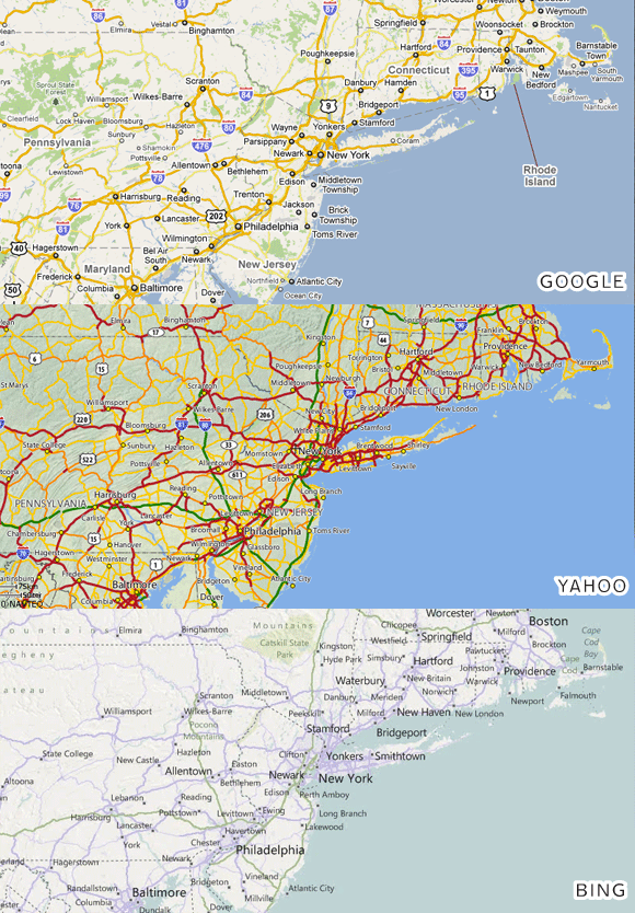
 Here's an excellent exploration of the ways in which Google maps are designed for greater legibility and usability than either Bing or Yahoo (cached here, if link is down). It's good to have the reasoning laid out so explicitly, despite, of course, accepting the premise as truth ever since the definitive work of Samberg and Parnell, in Lazy Sunday, so long ago: "Google maps is the best--True dat--Double true!" (is MapQuest even a thing anymore? Actually, for that matter, I wasn't even aware, before reading this, that Bing maps are a going thing).
It's fitting that the writer starts off with a quote from Edward Tufte, about information not necessarily leading to clutter--I think this essay and its illustrations are on par with the sort of work for which Mr. Tufte is known. (Incidentally, I see he is coming to SF to teach a series of one day classes this week. The $380 tuition includes copies of his four design books. Sounds like a pretty good deal to me. I wish I hadn't just had the past two weeks off, for travel and travel-related-illness, for which I need to work this week to catch up!)
Anyway, I bring it up here, because so many of the good design decisions that are pointed out, also come into play in sign design: establishing a smart hierarchy to distinguish importance of information; judicious use of space and isolation; the clever application of outlines to pull items out from their background; a sense of color that tempers fashion with contrast and practicality (as Rob Beschizza accurately notes, "Yahoo's looks like someone vomited a spaghetti dinner in Carrot Top's hair").
If I were a more ambitious blogger, I'd go through our flickr set and try to find sign examples that show where each of these points comes to bear on a sign we've done (assuming they're even to be found. In Imaginary Internet Utopia, I'm crowd-sourcing that task right now). I designed a sign a few weeks ago, that I'll be painting Monday, for instance, with lines of supportive text that are both smaller and in a lighter color than the title. I like to see when good ideas like that crop up across genres. It gives one the sense of tapping into some sort of cosmic truth.
