After eight years on 11th and Harrison, the shop will have a new home as of next week. The new space is only a couple blocks from where we are now and it is slightly bigger, allowing us to double the amount of easel space we have to work with. With the sign season picking up, and with another gallery show in the works, it will be nice to be able to stretch out a little bit more. No more bumping elbows while lettering, and no more shimmying past each other on our tip toes! It's an exciting move, but I will miss this cozy little shop we've called home for so long.

Movie title letter resources
[vimeo 20759580] I've been working recently on a sign/art piece for a client, that's supposed to incorporate a variety of letter styles into a palimpsest of motivational words and phrases, for their company. This video is chock full of lettering paths to pursue, and as a bonus, includes the delicious brass hook that's always cut off in the 5000 TV ads that use the opening bars of this same RJD2 track as backing music...
Towards the end, you get a few seconds' snippet of the trailer for this movie, which, while also full of nifty letter forms, should perhaps be prefaced with a caveat for epileptics:
[youtube=http://www.youtube.com/watch?v=tPxgi-PiNFE&w=560&h=349]
Sorry to have dropped the blogging ball for so long. My attention's been absorbed elsewhere, not least in sorting out a new, larger space for our shop, into which we're moving in the coming week.
Statement des Artistes
Here's the word salad promised earlier in the week. I'm not sure how, or if, it'll be used in conjunction with the show, but it least provides a snapshot of the some of the stuff that passes through my mind, on the subject of Genuine Authentic Hand Painted Signs, and in the end, promises nothing more than a bunch of signs on the wall:
To call these signs genuine and authentic practically begs people to differ. Everyone's got their own unique boundaries of authenticity, some of whose surely exclude our work on some technicality or other--if it's not the cheat of drawing patterns first, maybe it's the Electropounce™ that has replaced our hand-spun pattern wheels, or if not that, it's certainly our top secret computerized pattern generator, busily yearning to put our Electropounce™ out to pasture. Technicality--or technology, rather--projects one of the spectrums along which many of us might be able to locate a line (perhaps fuzzy) between authentic and not.Clients have often called upon us to hand paint letters and logos that were never designed to be hand painted, for no other reason, near as we can tell, than the hope that, in the end, they might "look hand painted". Just this week, we've had two customers each individually use the phrase "more authenticity", in describing what they were coming to us looking for in a sign, while providing us with digital files to work from, which themselves bore no particularly hand wrought characteristics. What is it about what we do that implies to our clients, or to their clients, something genuine and authentic?
For better or worse, everything we produce at New Bohemia Signs is ultimately realized at the end of a hand-held paint brush. We are limited, perhaps, by our choice of tools, but also by the quality of our practice. The "weak link" in our production line is in our capacity to render an internally envisioned ideal, with our given set of body parts. I have to guess that that point of reduction, to humanity, to human frailty, is where we're able to lay any claim to authenticity in what we do. It's from there, at any rate, that we're able to sell authenticity to whoever's buying. I've described that point elsewhere as "the joy of fine tuning the only copier that draws its current directly from our hearts". I liked that line then, so I'll use it again, and see how it fits here. That's how sign painting often works. Copy, trace, cut and paste. Whatever technological accoutrements are called upon to speed our work (or hamper our authenticity), it all passes through a needle's eye, that of aesthetic judgement, of steady hand eye coordination, and practice, practice, practice.
We're hoping, through this show, to call people's attention to their own standards for genuineness and authenticity, and to spark some conversations about how they (and we) do or don't manifest or recognize them. As I write, work is still in progress, so as of yet I can only guess that, beyond plying clever design sense and a steady hand, we might also employ some kind of word play, or even take a stab at postmodern allusion (whatever that is)... But if we don't, y'know, at the very least we'll decorate the place with a slew of genuine authentic hand painted signs.
Mark your calendars!
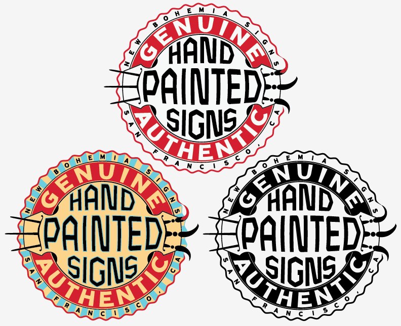
 Just put together postcards for our upcoming arty show, next month!
We're calling it Genuine Authentic Hand Painted Signs, and I'll try to toss together some word salad this week, to explain how we're hoping the show might perhaps comment on the ways in which we're willing accomplices in efforts to communicate authenticity via the painting of signs by hand. Or something like that.
I developed the center emblem after flipping through SF State's gallery of union symbols, mentioned a few months back, in Draplin's blog. I think we might make some stickers and/or buttons out of it, too. I like it. Hell, I'm even thinking of a tattoo...
Of kak koffs and kraals
 Elsewhere in my paltry collection of rare and/or antique books is a 1907 copy of Modern Painting, Hardwood Finishing and Sign Writing, attributed to George D. Armstrong, Frederick Hodgson, and Frances Delamotte. I write "attributed", because it seems that some significant portion of the 434 page section on "modern painting", also appears in The Painters' Encyclopaedia : Containing Definitions of All Important Words in the Art of Plain and Artistic Painting, dated 1887, and attributed to Franklin B. Gardner, whose name doesn't appear, near as I can tell, in the book I've got. I don't know anything about any of those names, and far be it from me to besmirch their doubtlessly fine reputations by shouting "pirates!". Fact is, I haven't really read much of the book, anyway: the "sign writing" portion is a dozen or so pages of not especially insightful commentary on which letter forms are best used where, and an assortment of not especially attractive "Plain and Ornamental and Ancient and Mediaeval Lettering from the Eighth to the Twentieth Century". Look through the internet archive for some of the best, and, arguably, the worst (or, if that's too harsh, perhaps the least useful) alphabets in the slender appendix.
There are, on the other hand, a lot of beautiful engravings throughout the book, including ten pages of a variety of wallpaper hangers' tools. I especially enjoyed these engravings of successive stages of faux woodgraining:
I wonder how useful those illustrations proved to be for the faux finishers of a century ago. I think they'd look good framed. And hung on a faux oak wall.
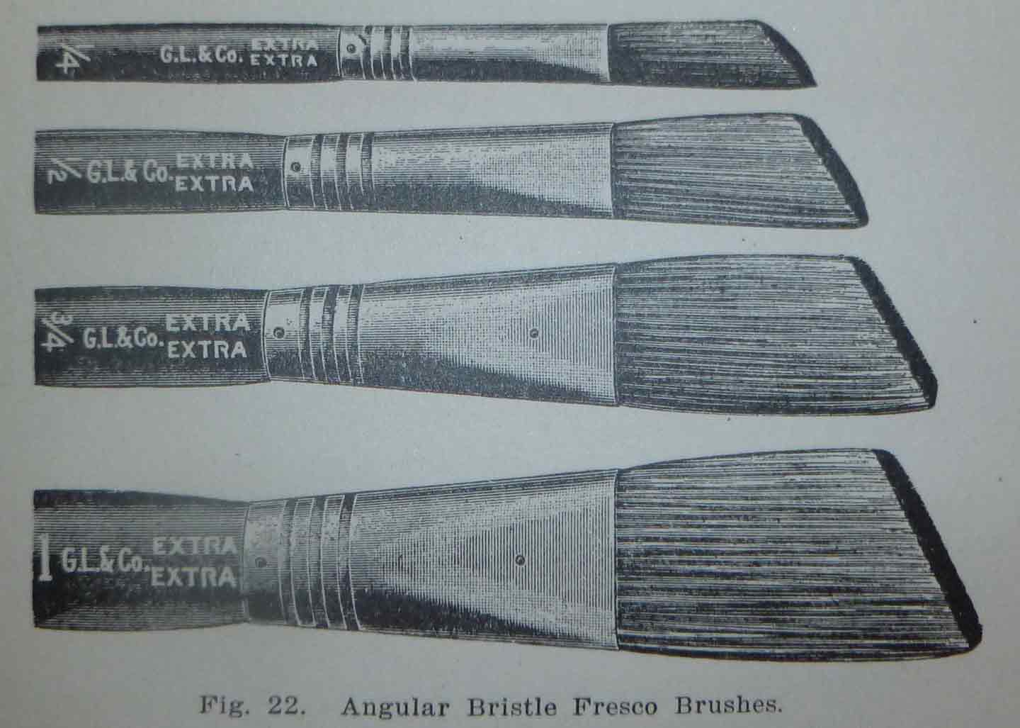
But honestly: I only mention this book, to take opportunity to recount the following passage, on the harvesting of boar bristles for fine paintbrushes. Most of the brushes we use at New Bohemia are called lettering quills, and, rather than Russian boar bristles, they consist of Russian squirrel tail hair, which I choose to believe is harvested harmlessly, with a few snips of scissor, only to regrow endlessly, on the wildly flicking tails of romping, happy, well-fed, feral squirrels--to say nothing of the geese who selflessly relinquish a few feathers, into the hollow shafts of which the squirrel tail hair is stuffed, and wire-bound to a stick... I could go on--it's all very wholesome--but I choose instead, every so often, to torment the vegans who work with me, by reading aloud of the bristle harvest. It may seem especially cruel of me, since Vegan Ken is the guy who gave me the book, in the first place, but actually, he rather seems to enjoy hearing the tale told, again and again--he even lobbies for it:
It would be an almost endless task to illustrate and describe all of the many varieties of paint and varnish brushes, and a few of the principal ones only will receive attention here. Russia is the great bristle growing country, and her exports reach as high as 5,000 tons of this commodity every year. Hogs in countless herds roam the deep Muscovite forests, where the oak, the pine, the beech, larch and other nut bearing trees cover the ground with acorns and nuts to the depth of a foot or more. But these swine are not all of value for their bristles. The perfect bristle is found only on a special race, and that race fattened in a certain way. On the frontiers of civilization all over the Muscovite territory are the government tallow factories where animals reared too far from the habitation of men to be consumed for human food are boiled down for the sake of their fat. The swine are fed on the refuse of these tallow factories at certain seasons, and become in prime condition after a few months' feeding. It is from these animals that the bristles of commerce mainly come. When the swine are fattened, and their bristles in fine color, they are driven in kraals so thickly that they can scarcely stand--irritated and goaded by the herdsmen till they are sullen with rage--kicking, striving, struggling and scrambling together in feverish rage, they are seized one by one, by the kak koffs, a class of laborers educated to plucking swine, and their bristles pulled out by the roots. The perspiration into which the poor creatures are thrown by their exercise causes their bristles to yield easily. The process is pleasant neither to the eye nor the ear. The hog strenuously resists with loud outcries, and vehement opposition. It does no good. Once seized, he is instantly divested of his clothing and then immediately released, goes grunting off to the woods.
Google maps
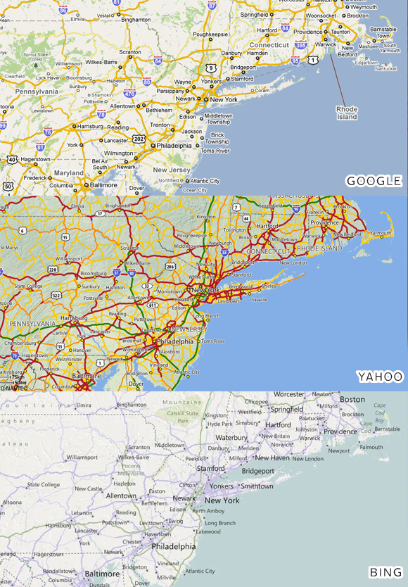
 Here's an excellent exploration of the ways in which Google maps are designed for greater legibility and usability than either Bing or Yahoo (cached here, if link is down). It's good to have the reasoning laid out so explicitly, despite, of course, accepting the premise as truth ever since the definitive work of Samberg and Parnell, in Lazy Sunday, so long ago: "Google maps is the best--True dat--Double true!" (is MapQuest even a thing anymore? Actually, for that matter, I wasn't even aware, before reading this, that Bing maps are a going thing).
It's fitting that the writer starts off with a quote from Edward Tufte, about information not necessarily leading to clutter--I think this essay and its illustrations are on par with the sort of work for which Mr. Tufte is known. (Incidentally, I see he is coming to SF to teach a series of one day classes this week. The $380 tuition includes copies of his four design books. Sounds like a pretty good deal to me. I wish I hadn't just had the past two weeks off, for travel and travel-related-illness, for which I need to work this week to catch up!)
Anyway, I bring it up here, because so many of the good design decisions that are pointed out, also come into play in sign design: establishing a smart hierarchy to distinguish importance of information; judicious use of space and isolation; the clever application of outlines to pull items out from their background; a sense of color that tempers fashion with contrast and practicality (as Rob Beschizza accurately notes, "Yahoo's looks like someone vomited a spaghetti dinner in Carrot Top's hair").
If I were a more ambitious blogger, I'd go through our flickr set and try to find sign examples that show where each of these points comes to bear on a sign we've done (assuming they're even to be found. In Imaginary Internet Utopia, I'm crowd-sourcing that task right now). I designed a sign a few weeks ago, that I'll be painting Monday, for instance, with lines of supportive text that are both smaller and in a lighter color than the title. I like to see when good ideas like that crop up across genres. It gives one the sense of tapping into some sort of cosmic truth.


