Ok, Mitch

Tuesday afternoon, we were paid a visit by Dmitry Pankov, from okMitch Studio, the mural and sign shop in NYC, which he runs along with his partner Angel Saemai.  Above, you can see the window they gilded for Brooklyn Circus, in (of all places) Brooklyn, a very refined and elegant counterpart to the window we gilded for Brooklyn Circus, in (naturally) San Francisco.  In fact, on their website, you can see a number of lovely examples of hand laid gold on glass.  They, too, have recently decorated a Napoletana-style pizzeria.

There's a bit of a difference, in that they don't seem to do much hand-lettering, except in wall mural applications.  If you click through to their Brooklyn Circus photo set, you can see some shots with the stencil adhered to the glass, and the gold laid over top.  Ken and I were just talking this morning about the process of silk screening back-up paint behind the gold, handy particularly for doing repeated gilds across multiple windows (as seen while driving past the Absinthe Bar, in Hayes Valley), and this looks like another fine method for keeping things regular, in print making fashion.

I haven't actually done it either of those ways, myself.  I'm not especially compelled to, nor am I put off by it, so long as they're well-designed signs, in the end.  I mean, I could turn up my nose at all the mechanical intervention, but really, I use the same machines to produce a lot of the patterns we use in our own signs.  Not having a stencil makes it a bit harder to stay inside the lines, true, but regardless, I'm glad people are still hand laying gold leaf on glass, however they go about backing it up.  As I tell clients, the nicest thing about gilding is, when the sign is done, it looks like gold.   I'm also glad that now I've met someone in NYC who I can recommend to the folk who occasionally call or write, looking for a gilder 'round those parts.  And, hey, they'll do murals, too.

Billboard tour

Our networking maven, Rani, pointed me to an article in the Make blog, titled Lost Knowledge: Sign Painting.  It does a pretty good job of encapsulating just where the trade stands right now.  I find myself often saying to people who ask how business is doing, that it's "not exactly a growth industry" (for which I might submit my bank account as exhibit one).  But I may have to reconsider my position: we're putting a little food on the table for a slowly widening coterie of folk, and there doesn't ever seem to be any waning of the number of people looking for apprenticeships and the like.  Feels like there's a pretty solid base in place for sign painting in the coming decades, even if the bare-bones, journeyman-and-his-sign-kit aura of it does call to mind, perhaps appropriately, an earlier era of economic misery.  It's been my experience that, while a lot of businesses are failing, other folk are getting pretty craftily entrepreneurial, and a lot of 'em need signs.  Some of 'em make signs. The Make article embeds a video about a recent ad campaign for Dewars, in New York, wherein Colossal Media painted a number of old-timey looking Shepard Fairey-designed billboards, that seemed to get a lot of people excited about reviving an ostensibly dying craft.  While I was looking up the link to that John Downer video from my previous post, I found that Stephen had also, around the same time, sent me a link to this documentary about NYC billboard painters (here working on a Stella campaign):

[vimeo http://vimeo.com/10562000 w=600]

Watching these, I'm wondering if, in what I gather to be a rather long-established relationship between liquor, beer and sign writers, the patronage has somewhat reversed poles lately?

I took a bike ride 'round my neighborhood yesterday, surveying some recent additions to the painted billboard renaissance. First, on 18th and Valencia, something that I guess treads the line between billboard and "ad mural", for Pabst:

This isn't the first or only Pabst mural in town.  Being primarily a painter-of-letters, the sloppy inscription on the can sticks in my craw, but I get that they're going for some sort of "socialist expressionism".  Maybe it's in keeping with Levi's "we are all workers" party line, appealing to our fair city's leftist leanings...  I wonder if Eric Herr painted the mural, and then Pabst hired a professional wall dog to climb up there and letter his byline.

This ad shares a wall with a number of other painted logos for the appliance retailer in the building behind it:

A couple blocks away, on 17th Street, at South Van Ness, is one of a few Hendrick's Gin billboards we've seen being painted recently:

Up close, this looks like it was done in 1Shot.  The lettering is very adeptly realized, but looks more like the work of illustrators, than of letterers.  Still, very handsome.  I'd have been proud to have painted this, but I don't doubt I would have bid it out of the ballpark.  I don't picture Bob Dewhurst taking on a job like this, and he's the only wall dog I know personally.  I wonder what the billboard painters of today are getting paid.

(I have to admit here, I'm not especially well connected within the sign industry.)

The Hendricks board was painted on a building next door to a big mural for 7 Tepees youth center:

I didn't go looking for who painted the mural, but our whole neighborhood is pretty rich with mural work, which I s'pose makes it a pretty ripe proving ground for painted ads.  Mural painting differs from billboard painting, at least in that it involves more charitable motives, and probably lower toxicity in the paint.  I 'spect you can find, easily enough, some photo sets of SF murals online.  You can book a tour, through Precita Eyes, who paint many of them, and from whom we buy graffiti coat for customers who demand it (in my experience, hand painted signs tend to attract much less graffiti than other signs--perhaps another reason for their recent uptick).  But now, back to billboards.

Another block up 17th, on Folsom, I came across this:

I'm gonna guess this is a Sailor Jerry Rum ad, though it doesn't say anything about rum anywhere on it.  I've seen smaller, printed wheat pasted ads around town, from the same campaign.  I wonder if this is a kind of loss leader, where all the cheap paste-ups subsidize whatever they paid someone to paint this.  Having just painted a tattoo flash art sign, I can only bow before the excellent blending job the painter here did with the enamels.  If they were able to do this quickly enough to be affordable for everyone involved (such as is always the sign writer's concern: "always aspire to greater speed"), then bravo!  This is a lovely piece of work.

I remember, years ago, biking past here and seeing the digipop people snapping a chalk line grid onto their wall, in which, over a couple of days, they painted individual radioactive-green blocks to form the letters of their name.  Their space seems to be vacant now, but I trust their DIY spirit lives on!

Another brief diversion on my billboard tour: just to the right of Sailor Jerry, a poet has her own painted mini-billboard:

The tiny phone number at the bottom, which you can call, to hear the poet, is hand-lettered, but the text around the portrait is all vinyl letters stuck onto plexi.  Shrug.

Now, way over on Potrero Hill, at the Anchor Brewery, is a beast of a very different stripe:

A ghost sign! You can even see the remnants of an older Anchor sign in the upper left!

That Make article, up top, has a few links to ghost sign collections.  You can find some 12,000 shots in the Flickr Ghost Sign Group Pool.  There's a lot of neat stuff in there I like to refer to.  I really like this wall in Grafton, WV.

Except that this Anchor wall isn't a ghost sign at all: it's a big digital print.  Bummer.  Although, I do sorta like the way the pixelation mucks with one's spatial perception, up close (which may not translate well to web photo):

Anchor Brewing is a pretty big company, but I guess they're still in another, smaller league, from entities like Dewars, Pabst, and Stella (and maybe Hendrick's?)--the only corporate behemoths in a position to afford genuine hand painted signs...  I think I'm speaking ironically, there.  Actually, New Bohemia had done some work for Anchor in the past, before my time, but I've never gotten a call from them, myself.  Somewhere, a bridge lay burned...  Still, I'm a fan.  I go to church across the street from here, at least in part because I love the smell of steaming barley mash on a Sunday morn.

Riding home from Anchor, I pass another kind of faux ghost sign:

For years, I thought this was just a disused billboard, tucked behind another, and not buffed out due merely to the charm of the little space man.  Then, when I got to know Dewhurst, and realized that's his business name and number (since changed), in the lower right, I thought maybe he'd gotten permission to paint the billboard there as a clever ad for his own services.  Turns out, he was hired to paint it there.  The building owner just liked the look of that billboard, and had a place to put it.  I'm lovin' it.

Every now and again, I have a customer who wants their sign "aged" in some way.  I usually try to sell them on the idea that the design will evoke another era, and the sign itself will get old soon enough without me sanding it to bits.  That said, I really enjoy when art comes up with new ways of getting us to ask "what's real?".  We just saw Exit Through The Gift Shop the other day, so I'm high on that kind of thing.

Anyone have any other favorite new or old painted billboards to share?

Tony's Pizza Slice House, part III (finito!)

Here's a shot of the finished interior signs:

On our second day at Tony's, while Josh and Ken finished their walls, I laid down some base coats and gold leaf, for the Doug Hardy-drawn sign, in the entryway.  Then, I came back and finished blending colors over all that, last Friday.  Yesterday, Thursday, was the next opportunity I had to get back to the place, for the last few signs in their order, some assorted phrases in the entryway panels, intended to communicate some "NY attitude".

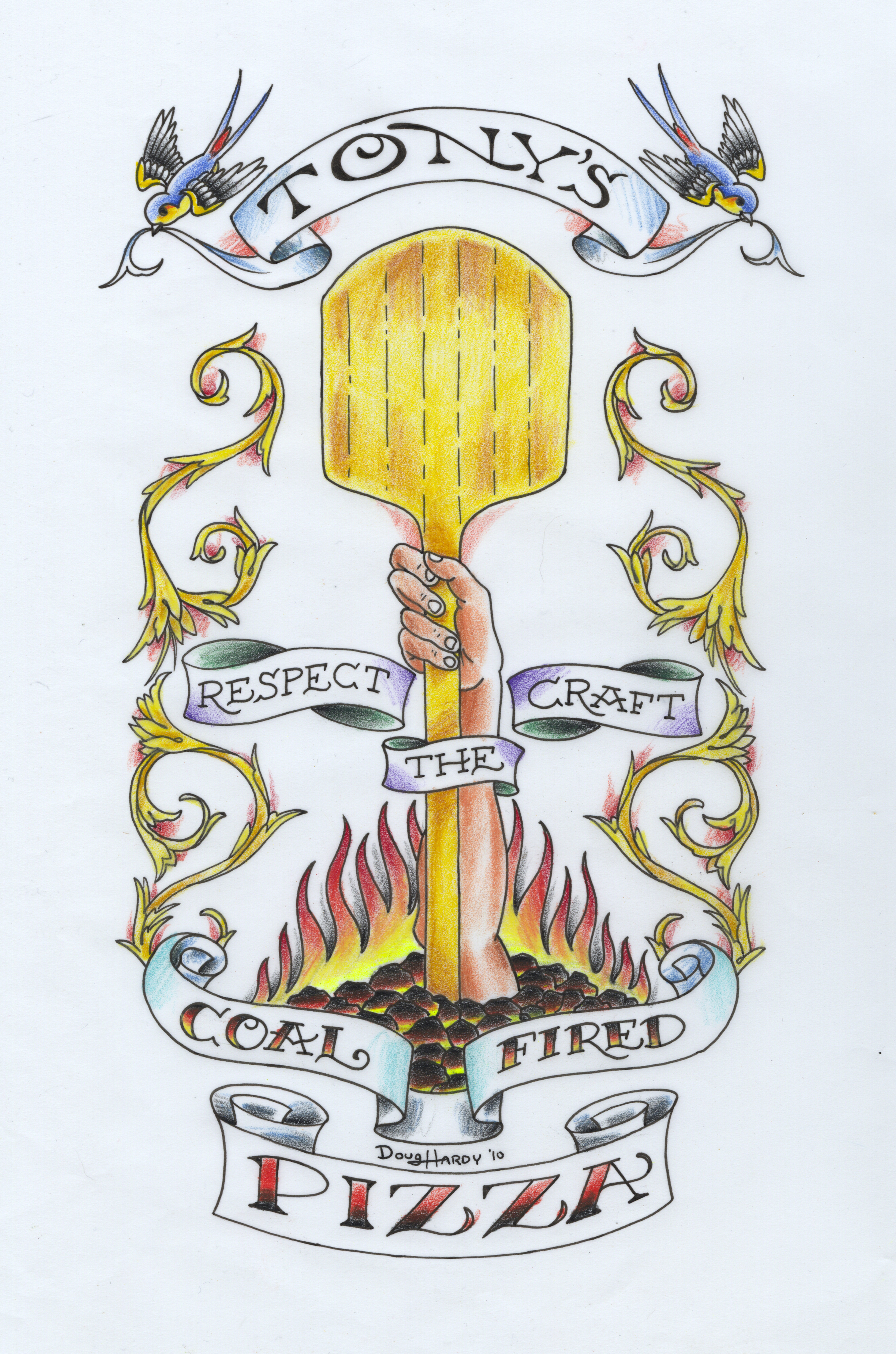
Here's the Doug Hardy drawing Tony gave us to paint:

And here it is, painted and gilded, with some glass installed over it subsequently, and a couple of the other signs I painted yesterday:

Here's a detail shot of that panel:

And here are the other three panels painted in the entryway:

These last three developed similarly to how I described the interior signs in the previous post.  Starting from a pencil sketch, I looked for some fonts approaching the size and shape, to build patterns from, stretching and fattening and smoothing out some curves along the way, and then just drawing in the casual script. For the "how" and the "do it", I took the chance to plug in some Roxy Black, which I learned about from this informative video:

[vimeo 10101935]

(That was fwd'd to me by Stephen Coles, shortly after he stopped by the shop to shoot Font Cast #12)

The pointing hand in the Italian ice panel is a re-sized version of a hand that we've been painting here for years, in different places, the pattern for which I finally scanned and vectorized, simultaneously sparing myself a bit of hand drawing and maybe breaking the hearts of imaginary traditionalists everywhere...

But, y'know, I like the way that hand looks.  If you want me to draw and paint a different one, I can, but this wheel done been invented! On the other hand, I can't deny: it's a slippery slope...  So, this is some of the argument that goes on in the head of any sign painter in the digital age, and we all find a comfy niche somewhere along that slope.  I'm both encouraged and a little bit puzzled, that some of the youngsters around the shop here are decidedly more anti-computorial than am I.  If they can resist my pernicious digital influence, they stand a good chance of hoisting the hand-painted sign into the next century!

Anyway, here are the sketches:

I should mention, too, that during this whole project, I was very much inspired by the endpapers of the Store Front book I was raving about a few posts ago:

Oh, and I should really, really mention, too, that, OH MY GOD--the pizza this guy serves is absolutely bonkers delicious!  I mean, the slices joint isn't open yet, so we were going a couple doors down, to his sit-down place, for lunch, and eating whole pies, each of us.  So, I tried four different pies over four lunches, and it's hard to pick a favorite...  But, y'know what, I will: the Cal Italia.  There was some prosciutto on there, some shaved parmesan, little dollops of melted gorgonzola, a spiral drizzle of Balsamic reduction, and in the middle of each slice, a puddle of fig jam.  It reminded me of this appetizer I like to make, wherein I stuff halved dates with blue cheese and roll 'em in crushed pistachios, the mix of sweet and savory... so good.  So good!  Oh, no, wait--I just realized I'd already mentioned that one earlier--my new favorite... Well, it's a toss-up between the New Yorker--a straight-up meat lover's pie, sausage and pepperoni, their best seller, Tony says--and the Salsiccia con Treviso, which hits some of my favorite sweet vs. savory notes.  It's got sweet caramelized onions, and a mild, honey-sweetened house-made sausage, balanced with whatever "treviso" is (it looked kinda like radicchio).  Just a wee bitter.  Anyway, it worked.

Eat at Tony's.  They have some nice signs, too.

Chronicle Books loves hand-painted signs

I remember some years ago, a troop of their designers came by the shop (when I was holed up in a 4th floor room at 3rd and Townsend) for a brief demo of, I think, glass gilding, and/or just my process of carrying projects from sketch, to perforated penciled pattern, to sign.  They rewarded me with a copy of Hatch Show Print that I still dip into frequently, and today they've given us a shout out on their blog. Y'all must have an all new troop of designers by now--ring us up, drop on by!

Tony's Pizza Slice House, part II (day one, on-site)

I got the patterns done yesterday, as mentioned in the previous post, and today, Ken, Josh & I spent a long day painting them on the walls of the new place, interrupted only by a delicious lunch on Tony's pizza (the boys got their typical vegan fare, and I had a "Cal Italia", with prosciutto, gorgonzola, shaved parmigiana, a drizzled balsamic reduction, and dollops of fig preserves--I highly recommend it). So, I'll walk you through a bit of how we did this.  I pasted the scanned sketches onto an Illustrator document, and did my best to duplicate them with vectorized shapes:

Tony's digital overlays

I started with the Chicago wall, because it promised to be easiest.  I searched my Linotype Font Explorer X library, through my set of "rectilinear bowls", for something approaching the shape of the "Chicago" letters, and settled on DIN Mittelschrift.  I spaced and kerned the word to my satisfaction, then built new letters over top, using fat round-ended strokes and circles, outlining the strokes, dividing and combining them into letters that matched my sketch.  I built the inline feature using tricks gleaned from Leslie Cabarga's Logo, Font & Lettering Bible (a valuable resource for digital neophytes like me, provided one can avoid judging it by its gruesome cover).  For the other lines of text (on all three walls) I pulled Magnesium out of my "thick 'n' thin" set, because I like its proportions, and it's easy enough to ignore the oblique terminals on the crossbars.  I sheared some of the text (and the sausage-on-a-stick) vertically a few degrees, and sheared the rest of it horizontally, and messed with the shape and size of the exclamation points.

For the "New York" wall, I found a font in an album of 19th century printers' catalogs (given me by Ken, for my birthday, last week), which shared a few characteristics with my sketched ideas, and improved on some other characteristics.  It was Font #1,566 from the Bruce Type Foundry.  I scanned and vectorized it, then cleaned up and altered what needed letters I could find, inventing the rest--these old catalogs tend not to print entire alphabets, preferring to rattle off enigmatic phrases, like "FASHIONABLE MANUAL Directions for Respectable Sponging Indispensable to Diners-Out", which doesn't contain the W, Y or K that I need for "New York Delicatessen".

For the "Slice House" wall, I sifted through my "Westerns" set for a condensed font with thorns and flared serifs, and settled on Pointedly Mad.  Its strokes are far too fat, and its serifs too slabby, to bother trying to manipulate digitally into a usable pattern, but it's close enough, with a little stretching, to the proportions of the letters in my sketch, that I can use them as dummy letters.  It's easier to fiddle with kerning digitally, as well as to bend the text into a symmetrical arch.  Then, once printed, I can scribble all over the outlines, adjusting the letters at whim, before perforating the pattern.  I can also add all the swirly foofaraw around the edges, based on elements of Tony's menu, which are a lot easier to render gracefully with the arc of an arm than with a finger stroke across a touch pad (as evidenced by the crude effort in the mock-up, above).

This has become a very satisfying way I've developed, of using the digital editing and printing technology I have at hand, to relieve much of the tedium and erasure involved in letter spacing; and using my comfort and familiarity with pencil-based design to spare myself the soul-sucking drudge of building designs digitally.  So long as a customer doesn't need a digital version of a sign design, like for future printing purposes, this hybridized pattern-making process helps me feel like I'm making the fullest use of what I do best.

I wasn't able to take the still camera with me today, but I had my Flip cam on hand.  Here are some action shots I got, of the boys stroking out some letters, while I waited for Scott to drop off the extra pounce powder we'd neglected to pack, and then, of the work, in a more completed state:

Toward the end of the day, I learned from Tony that his new venture was featured in today's Inside Scoop, the restaurant news section of the SF Chronicle, and of their web version, SFGate.  Since the space is still under construction, he forwarded them the sketches I'd sent him last week, and they printed them right in the story, albeit with some kind of weird coffee stained parchment texture over top.  They also included a portion of the Doug Hardy drawing that I'm going to start painting in a panel in the entry way of the restaurant, tomorrow.

Slice House sketches

Way behind the eight ball today, scrambling to turn these sketches into full size patterns for painting on a few 4'x12' walls tomorrow, maybe with some digital versions en route, for menu printing purposes...