Vanilla Shadow Mixing Music

This week we made an ice cream cone sign, for Super Duper Burgers.  They wanted one modeled on the cone we painted for the San Francisco Chocolate Store (which, I'm told, might actually be on the same block as Super Duper...), but with a swirl of soft serve atop.

Ken took charge of designing, laying out, and painting the letters.  After I pulled the shape of the swirl from the fro-yo art we'd drawn up from a reference provided for an old Loving Cup sign, I tasked Aaron with turning it into the chocolate-vanilla blend that Super Duper asked for.  My instructions to him were that it be in flat, graphic colors, no blending, with a chocolate color, a vanilla color, and a shadow tone for each.

We have a wall rack of Dixie cups and coffee cups, each half full of some color or other we've mixed for various jobs--many of which never get used again, if not for a sample sign or practice session.  Every half year or so, they end up in the trunk for a run to the toxic waste drop-off point for the SF City Dump.  But Aaron managed to find therein, both a creamy milk chocolate, and a somewhat chocolatey-er shadow of creamy chocolate.  They looked, in the cups, very much like melted ice cream.  I have no idea what we'd mixed them for before.  They weren't in the other cone sign.  They were, however, making us hungry for ice cream.

Aaron whitened up some ivory, to serve as vanilla, but his work day ended before he could tackle the Vanilla Shadow.  Thus, the job fell to me, leaning as I ever do, on the ol' color theory maxim that complementary colors make shadows for one another.  So, I dunno, you can judge the results, above--I had a kind of lavender in mind; but more importantly: it felt imperative that a vanilla shadow mixing mood be set, by the appropriate musical selection.  Vanilla shadow mixing music...

Fortunately, just a week earlier, I'd reacquainted myself with an erstwhile playlist fave, the sets Derrick Bostrom published some time ago, on his Bostworld blog, as Your Favorite Little Podcast.  I highly recommend you subscribe through iTunes, and "get all", especially if you have any pressing need to tap into the darker side of vanilla.

I don't want to over-describe it...  sure, there's a little bit country, a little bit rock 'n' roll... has been derided as "elevator music".  I write that much just to sift out the chaff.  Grainier folk: dig in! It's a rich selection.

While you're waiting for all that to download, avail yourselves, under no obligation, of course, to the remaining "trash, treasures, oddities and obsessions" Mr. Bostrom has catalogued in Bostworld.  He's benefiting us all, photographically and stereophonically, through the troves his local Arizonan antique and thrift dealers have reaped, presumably from the inward migration of our nation's retirees.  I think I'm gonna get our apprentices to practice their grasp of the permeability of the top 'n' bottom guides in a row of letters, by painting the fonts from these Union Pacific calendar pages...

You might also be interested to read his reports on what it's like to have been a Meat Puppet--although you'd prob'ly wanna be mixing something other than vanilla shadow at the time.

Then, too, you might wanna check out his weekly show, C'mon, Let's Live a Little!, on Luxuria.com radio.  It's just past 3 on a Saturday afternoon, right now, so I'm tuning in live!

To be fair, one need not only be mixing vanilla shadow to enjoy this.  Ken and I were blaring C'mon, Let's Live a Little! through the soundsystem at Revival, while we were working on that this week, until the upstairs neighbors called down to the maître d', and asked that it be turned down.  So, it works well with laying gold leaf, too.
More Levi's signs

We painted some signs in the windows at Levi's Union Square, and snapped some better shots of stuff we did there last month.

Yeah, that's right.  Go forth yourself.  You know you want to.  It's alright.  We got your back.  You might stop in and buy some Levi's workwear before you do, though.

Revival Bar & Kitchen transom sign, design process pictorial

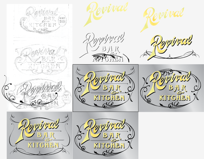
Alright, I'm gonna try to this with as many pictures and as few words as I possibly can... (ha!).  Ask me a question, if you have any. We just put up a gilded sign over the door at a new restaurant in Berkeley, and here are some sketches leading up to it.

At first meeting, the client mentioned liking old ghost signs, and the look of the Dollar Dreadful website.  They already had a make-shift logo, to bide them through their opening weeks, and the only part of it they suggested maybe keeping was the "+" linking bar and kitchen.  I sketched some, we talked more, I sketched more...

The simple knotwork motif in the frame of that bottom sketch, was adapted from a sign New Bohemia did for Chow, way back in the 20th century.  Anyway, we ended up dropping that, but developed the letter style some more, running the v's through a sharpener, among other things.

At this point, I was hoping maybe to use a font I'd designed a year or so ago, for another job which, as it happens, had fallen through:

But Revival didn't like it much, prob'ly for the same reasons that Curator didn't like it much.  Too pointy?  They suggested they liked Grant's Antique, from the Letterheads Font shop, and we agreed that the Boston Candies logo on that page was a lot like what they wanted.  So, I sketched some more, looking at that, some Dover frame collections, and my copy of Atkinson sign reproductions:

They liked those, and also decided to go with an ampersand, instead of the plus sign.  While working on a few takes on the frame  I went on a Letterhead Fonts shopping spree, then tried making them fit the sketch shapes, so they could have a printable logo version of the sign.

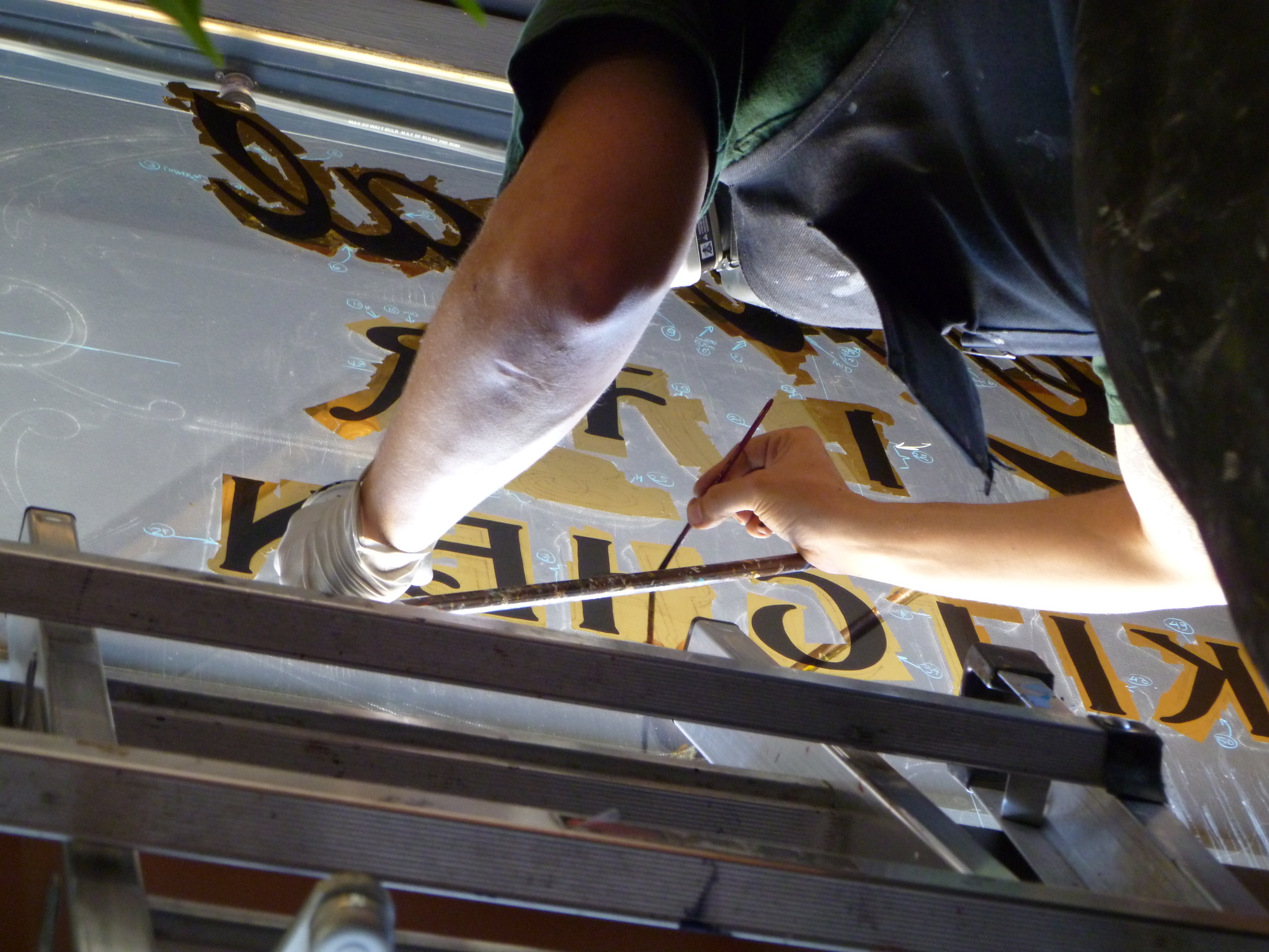
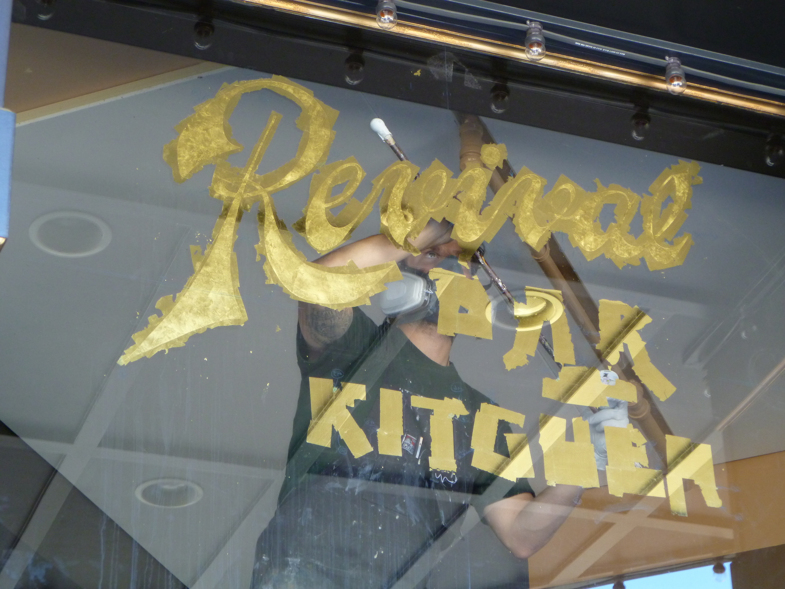
Eventually, we settled on something, and went out to gild, on Monday.

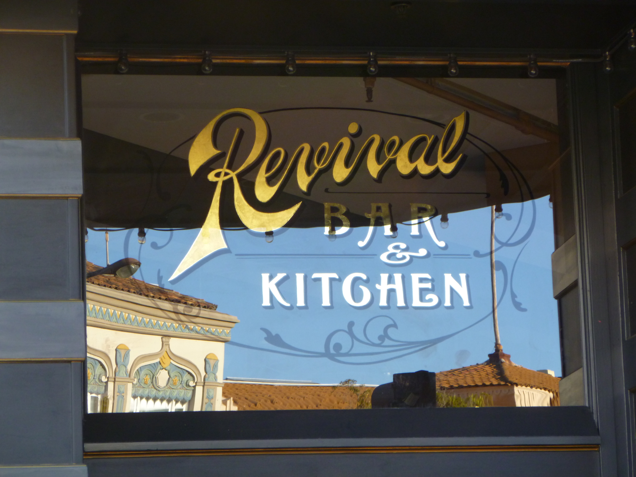
When I saw the deep overhang above the transom, I decided to put matte centers on "Revival", so it would diffuse more light, and be more visible from positions where the window reflected the dark ceiling.  I think it'll look really good in the light of those little marquee bulbs, too.

And here's what it looks like done:

Little City Gardens

Caitlyn weeding Try as we might, we just have the hardest time keeping that scrappy li'l Caitlyn 'round the shop any more than we do.  She's always off digging up trouble in her garden, launching political battles about it, then going and telling the New York Times!

(Rather than just teasing Caitlyn on account of her describing herself as "fairly scrappy... and often pretty dirty", I should point out that she has a couple other evocative quotes in the story, too, involving huge jazz and desperate sunflowers)

3 Potato 4

I just learned (or maybe re-learned?  I'm so flighty...  It's the fumes!), that an old friend, Beth, keeps a blog of those things that twirl her pinwheel in the realms of art and design.  She recently posted about the vintage sign offerings from Three Potato Four, an online purveyor of esoteric antiquities, whose site I need to stop perusing, at least long enough to finish writing about.  Their home page says "storefront opening soon".  No other info than that, about the brick-and-mortar,  but I hope I can visit, when I'm back east over the holidays, and up in Philly for a stop at the Mutter Museum...

Besides accumulating stray metal letters and service station price numbers, the odd header card and bus bench sign, they've retained the services of "an accomplished sign painter with 30+ years in the sign-making business", to paint personalized shingles, simply designed, made to order!

I'm totally stealing this idea. I remember Steve Karbo wanting to get something like this going, when he was working here again, last year.  Too late now, but I could totally imagine having had a little Karbo-powered sweat shop in the back corner...  I'll try and send him a link, if he's still online in his Arkansas hideaway, and maybe he'll get inspired, too.  In the meantime, if I ever actually get such an operation going here, we'll only be able to offer 10+ years in the biz...